This notebook contains the code I presented for the BTSA book club session on the 11th August 2020. You can find the description of the session (& other meetup sessions) here.
It is an introductory notebook to create predictions of the time series data provided and measure their performance using Facebook Prophet.
Setup and data exploration
import numpy as np
import pandas as pd
from fbprophet import Prophet

import matplotlib.pyplot as plt
import seaborn as sns
sns.set_style('darkgrid', {'axes.facecolor': '.9'})
sns.set_palette(palette='muted')
sns_c = sns.color_palette(palette='muted')
%matplotlib inline

from pandas.plotting import register_matplotlib_converters
register_matplotlib_converters()

# Set global plot parameters
plt.rcParams['figure.figsize'] = [12, 6]
plt.rcParams['figure.dpi'] = 100
The data provided contains a simmulation of sales data between 2018-01-01 and 2021-06-30. In addition there is a feature media which could be used as an external predictor. Below I read the dataset and make simple transformations on the date column.
# read data
data_df = pd.read_csv('../data/sample_data_1.csv')

data_df = data_df.assign(
    date = lambda x: pd.to_datetime(x['date']),
    year = lambda x: x['date'].dt.year,
    month = lambda x: x['date'].dt.month,
    day = lambda x: x['date'].dt.day,
    dayofyear = lambda x: x['date'].dt.dayofyear
)
data_df.head()| date | media | sales | year | month | day | dayofyear | |
|---|---|---|---|---|---|---|---|
| 0 | 2018-01-03 | 0.0 | 6.258472 | 2018 | 1 | 3 | 3 |
| 1 | 2018-01-04 | 0.0 | 6.170889 | 2018 | 1 | 4 | 4 |
| 2 | 2018-01-05 | 0.0 | 5.754669 | 2018 | 1 | 5 | 5 |
| 3 | 2018-01-06 | 0.0 | 5.968413 | 2018 | 1 | 6 | 6 |
| 4 | 2018-01-07 | 0.0 | 5.285262 | 2018 | 1 | 7 | 7 |
Below I include a visualization of the sales and media data over date.
fig, ax1 = plt.subplots()
ax2 = ax1.twinx()
sns.lineplot(x='date', y='media', data=data_df, color=sns_c[9], label='media', ax=ax1)
sns.lineplot(x='date', y='sales', data=data_df, color=sns_c[5], label='sales', ax=ax2)
ax1.legend(bbox_to_anchor=(1.22, 0.42))
ax2.legend(bbox_to_anchor=(1.22, 0.5))
ax1.tick_params(axis='y', labelcolor=sns_c[9])
ax1.set_ylabel('media', fontdict={'color': sns_c[9]})
ax1.set(title='Sales and Media')
ax2.grid(None)
ax2.tick_params(axis='y', labelcolor=sns_c[5])
ax2.set_ylabel('sales', fontdict={'color': sns_c[5]});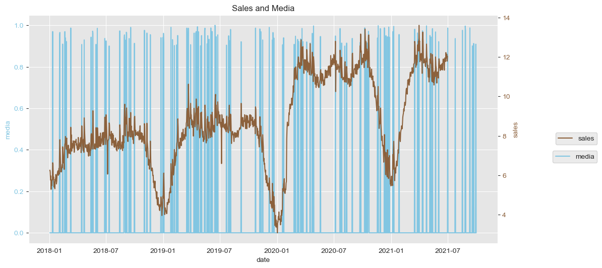
Some conclusions I derived from this visualization:
- The dimension
medialooks like is going to be a good candidate to external predictor ofsales.
- It looks like the feature
salesshows clear yearly + quarterly seasonalities.
- The time series
salesseems to have a incresing multiplicative trend, since it does not only grows over time but also has increasing variation over time.
- Doesn’t look like there are missing
salesdata other than at the end of the time period (which is expected, since the exercise is to forecast).
- There are recurring drops appearing around the middle of the year, I will take a look at whether it coincides with a special date.
First I confirm my assumption about missing values other than at the end of the period.
data_df.tail()| date | media | sales | year | month | day | dayofyear | |
|---|---|---|---|---|---|---|---|
| 1362 | 2021-09-26 | 0.000000 | NaN | 2021 | 9 | 26 | 269 |
| 1363 | 2021-09-27 | 0.000000 | NaN | 2021 | 9 | 27 | 270 |
| 1364 | 2021-09-28 | 0.000000 | NaN | 2021 | 9 | 28 | 271 |
| 1365 | 2021-09-29 | 0.909033 | NaN | 2021 | 9 | 29 | 272 |
| 1366 | 2021-09-30 | 0.000000 | NaN | 2021 | 9 | 30 | 273 |
(data_df[data_df.sales.isna()].date.min(), data_df[data_df.sales.notna()].date.max())(Timestamp('2021-07-01 00:00:00'), Timestamp('2021-06-30 00:00:00'))(data_df.shape[0], data_df[data_df.sales.notna()].shape[0], data_df[data_df.sales.isna()].shape[0])(1367, 1275, 92)Next I inspect the misterious drops at around mid-year. Let us find out whether it is a consistent date (it may be a special holiday).
min_july_df = data_df.loc[data_df.month == 7 ][["year", "sales"]].groupby("year").min()
data_join_07min_df = data_df.join(min_july_df, on="year", rsuffix="07_min")
data_join_07min_df[data_join_07min_df.sales == data_join_07min_df.sales07_min]
| date | media | sales | year | month | day | dayofyear | sales07_min | |
|---|---|---|---|---|---|---|---|---|
| 185 | 2018-07-07 | 0.0 | 6.057521 | 2018 | 7 | 7 | 188 | 6.057521 |
| 550 | 2019-07-07 | 0.0 | 6.591582 | 2019 | 7 | 7 | 188 | 6.591582 |
| 916 | 2020-07-07 | 0.0 | 10.245428 | 2020 | 7 | 7 | 189 | 10.245428 |
indeed it coincides to 07.07, so I will create a dummy to encode it
def is_07_july(ds):
    date = pd.to_datetime(ds)
    return (date.month == 7 and date.day == 7)
Let us incorporate this new dummy in the data and subset the training dataset I will use for forecasting.
data_df["ds"] = data_df.date
data_df["y"] = data_df.sales
data_df["is_07_july"] = data_df["ds"].apply(is_07_july)

train_df = data_df[data_df.sales.notna()][["ds", "y", "media", "is_07_july"]]
Forecasting
My idea now is to answer the question:
Is the feature media useful for prediction?
Therefore, I define 2 models:
mis a simple model which will have multiplicative seasonality and prophet will capture the seasonality as well.
m_w_media_0707is the same model asmwith 2 external additive regressors:mediaand the dummyis_07_july.
I create a 30 days forecast for each of them.
m = Prophet(seasonality_mode='multiplicative')
m.fit(train_df[["ds", "y"]])
future = m.make_future_dataframe(periods=30)
forecast = m.predict(future)
forecast["errors"] = forecast.yhat - train_df.y
INFO:fbprophet:Disabling daily seasonality. Run prophet with daily_seasonality=True to override this.m_w_media_0707 = Prophet(seasonality_mode='multiplicative')
m_w_media_0707.add_regressor("media", mode="additive")
m_w_media_0707.add_regressor("is_07_july", mode="additive")
m_w_media_0707.fit(train_df)
future = m_w_media_0707.make_future_dataframe(periods=30)
future["media"] = data_df.loc[data_df.date <= future.ds.max()]["media"]
future["is_07_july"] = future["ds"].apply(is_07_july)
forecast_w_media_0707 = m_w_media_0707.predict(future)
forecast_w_media_0707["errors"] = forecast_w_media_0707.yhat - train_df.yINFO:fbprophet:Disabling daily seasonality. Run prophet with daily_seasonality=True to override this.Prophet very easily plots the calculated forecast, including the training data & confidence intervals.
Below, one can cleary see the difference between the two models.
fig1 = m.plot(forecast)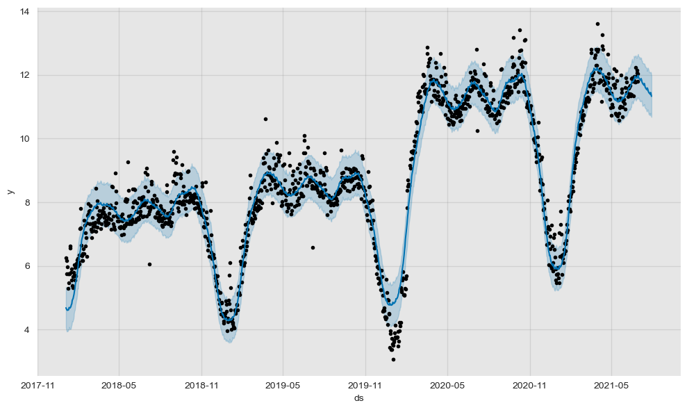
fig1_media_0707 = m_w_media_0707.plot(forecast_w_media_0707)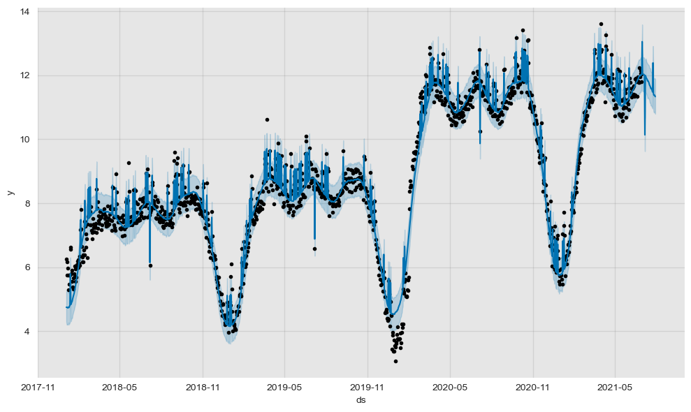
Moreover, with the plot_components function one can very easily inspect the trend and seasonality Prohet captures form the models.
I have commented out the visualization for the second model since they are the same for both models.
fig2 = m.plot_components(forecast)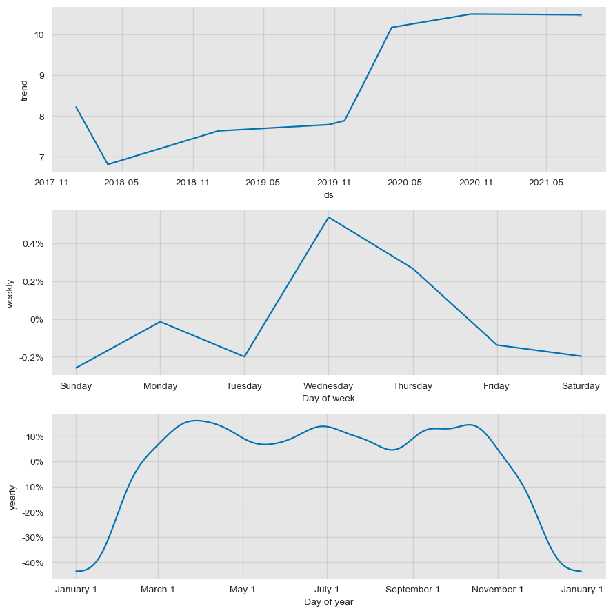
# fig2_media_0707 = m_w_media_0707.plot_components(forecast_w_media_0707)Next I plot the sales time series with its forecast in the left y axis. In the right y axis one can see the errors of the forecast.
fig, ax1 = plt.subplots()
ax2 = ax1.twinx()
sns.lineplot(x='ds', y='errors', data=forecast, color=sns_c[3], label='errors', ax=ax2, alpha=0.6)
sns.lineplot(x='ds', y='y', data=data_df[data_df.sales.notna()], color=sns_c[9], label='sales', ax=ax1)
sns.lineplot(x='ds', y='yhat', data=forecast, color=sns_c[5], label='forecast', ax=ax1)
ax1.legend(bbox_to_anchor=(1.22, 0.42))
ax2.legend(bbox_to_anchor=(1.22, 0.5))
ax1.tick_params(axis='y')
ax1.set_ylabel('sales')
ax1.set(title='Sales and Forecast (solo)')
ax2.grid(None)
ax2.tick_params(axis='y', labelcolor=sns_c[3])
ax2.set_ylabel('errors', fontdict={'color': sns_c[3]});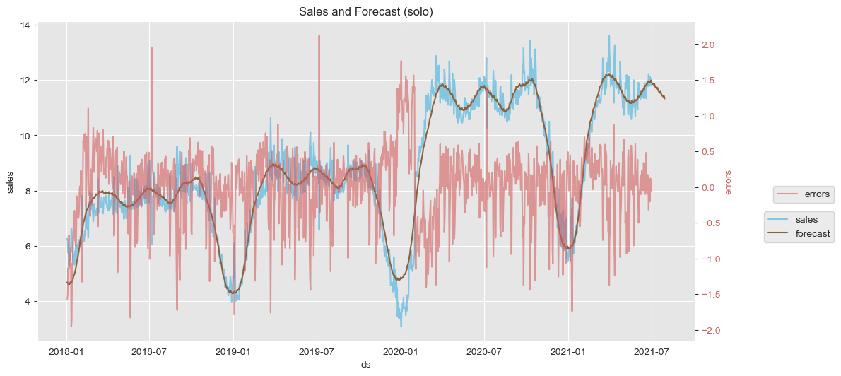
fig, ax1 = plt.subplots()
ax2 = ax1.twinx()
sns.lineplot(x='ds', y='errors', data=forecast_w_media_0707, color=sns_c[3], label='errors', ax=ax2, alpha=0.6)
sns.lineplot(x='ds', y='y', data=data_df[data_df.sales.notna()], color=sns_c[9], label='sales', ax=ax1)
sns.lineplot(x='ds', y='yhat', data=forecast_w_media_0707, color=sns_c[5], label='forecast', ax=ax1)
ax1.legend(bbox_to_anchor=(1.22, 0.42))
ax2.legend(bbox_to_anchor=(1.22, 0.5))
ax1.tick_params(axis='y')
ax1.set_ylabel('sales')
ax1.set(title='Sales and Forecast (with media & 0707)')
ax2.grid(None)
ax2.tick_params(axis='y', labelcolor=sns_c[3])
ax2.set_ylabel('errors', fontdict={'color': sns_c[3]});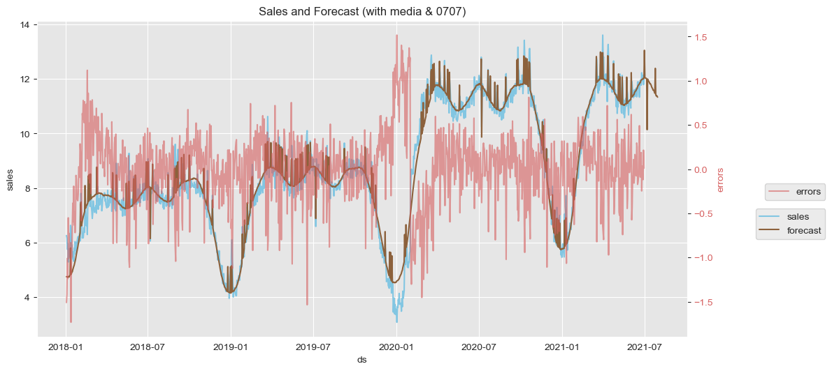
For the first model (where only seasonality and trend are considered) one can see the big errors in July which dissapear in the second model, thanks to the dummy variable. Also the overal range of errors seems to decrease a bit (from (-2.0, 2.0) to (-1.5, 1.5)). However, in both models there is something annoying at the end 2019. I have tried to create a dummy around those dates but it did not work.
Evaluation of model performance
I will make use of Prophet’s crossvalidation function to evaluate the performance of the models created above.
For this, one needs to set some constants:
cv_initial: an initial set of points to be included in the first iteration as training data. Ideally, they should include a full seasonality and trend loop in order to account for it in the following predictions.
cv_period: how many data points will be included to the training set after each iteration.
cv_horizon: what will be the forecasting window at each iteration. (I personally like the analogy with the horizon which moves with you at every step you make :) )
from fbprophet.diagnostics import cross_validation
cv_initial = '1185 days'
cv_period = '7 days'
cv_horizon = '30 days'
df_cv = cross_validation(m, initial=cv_initial,
                            period=cv_period, horizon = cv_horizon)
# df_cv.head()
INFO:fbprophet:Making 9 forecasts with cutoffs between 2021-04-05 00:00:00 and 2021-05-31 00:00:00df_cv_w_media_0707 = cross_validation(m_w_media_0707, initial=cv_initial,
period=cv_period, horizon = cv_horizon)
# df_cv_w_media_0707.head()INFO:fbprophet:Making 9 forecasts with cutoffs between 2021-04-05 00:00:00 and 2021-05-31 00:00:00Later, with the performance_metrics function, one gets a dataframe summarizing the metrics averaging the forecast errors at every horizon day.
from fbprophet.diagnostics import performance_metrics
df_p = performance_metrics(df_cv)
df_p.head()| horizon | mse | rmse | mae | mape | mdape | coverage | |
|---|---|---|---|---|---|---|---|
| 0 | 3 days | 0.184054 | 0.429015 | 0.372012 | 0.032679 | 0.030733 | 0.851852 |
| 1 | 4 days | 0.161923 | 0.402396 | 0.338746 | 0.029616 | 0.030733 | 0.925926 |
| 2 | 5 days | 0.219794 | 0.468822 | 0.363396 | 0.031197 | 0.028344 | 0.814815 |
| 3 | 6 days | 0.243696 | 0.493656 | 0.374984 | 0.031986 | 0.022488 | 0.777778 |
| 4 | 7 days | 0.287547 | 0.536234 | 0.399342 | 0.033638 | 0.023716 | 0.740741 |
df_p_w_media_0707 = performance_metrics(df_cv_w_media_0707)
df_p_w_media_0707.head()| horizon | mse | rmse | mae | mape | mdape | coverage | |
|---|---|---|---|---|---|---|---|
| 0 | 3 days | 0.138125 | 0.371652 | 0.300312 | 0.026310 | 0.021001 | 0.814815 |
| 1 | 4 days | 0.118737 | 0.344582 | 0.284383 | 0.024855 | 0.018320 | 0.814815 |
| 2 | 5 days | 0.106944 | 0.327023 | 0.243355 | 0.021236 | 0.013283 | 0.814815 |
| 3 | 6 days | 0.112950 | 0.336080 | 0.244234 | 0.021324 | 0.010519 | 0.814815 |
| 4 | 7 days | 0.104026 | 0.322530 | 0.245283 | 0.021298 | 0.016246 | 0.851852 |
# extracting the horizon days
df_p = df_p.assign(
    horizon_days = lambda x: x['horizon'].dt.days
)
df_p_w_media_0707 = df_p_w_media_0707.assign(
    horizon_days = lambda x: x['horizon'].dt.days
)
Finally, by selecting the desired metric in the metric_to_plot variable, I plot a comparison of the desired performance metric for both metric.
As an example, I select the mae= Mean Absolute Error. It shows that the second model performs much better than the simple one.
metric_to_plot = 'mae'df_perf_plot_wide = df_p[['horizon_days', metric_to_plot]].join(df_p_w_media_0707[['horizon_days', metric_to_plot]].set_index('horizon_days'), on='horizon_days', lsuffix='_simple', rsuffix='_w_media_0707')
df_perf_plot_long = pd.melt(df_perf_plot_wide, id_vars=['horizon_days'], value_vars=[metric_to_plot + '_simple', metric_to_plot + '_w_media_0707'])fig, ax = plt.subplots()
sns.barplot(x='horizon_days', y='value', hue='variable', data=df_perf_plot_long, ax=ax)
ax.legend(bbox_to_anchor=(1.22, 0.42))
ax.set(title=f'Comparison of {metric_to_plot} (simple model vs with media & 0707)');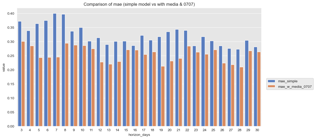
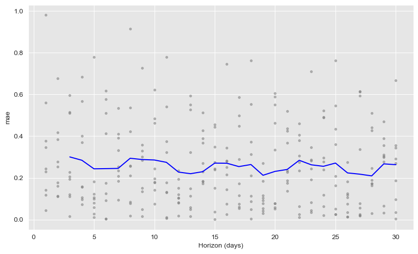
If one wants more detail, the plot_cross_validation_metric function easily plots the average metrics with the real values for each horizon day.
from fbprophet.plot import plot_cross_validation_metric
fig = plot_cross_validation_metric(df_cv, metric=metric_to_plot)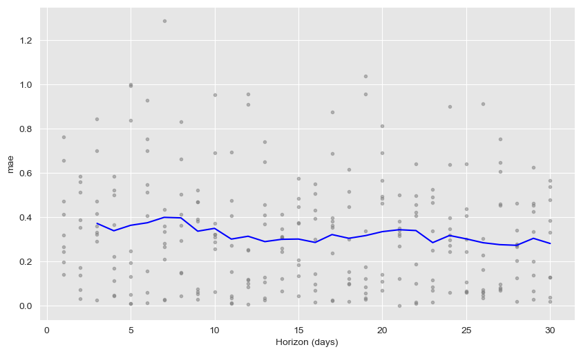
fig = plot_cross_validation_metric(df_cv_w_media_0707, metric=metric_to_plot)